Progress Bar
If you’ve ever checked out my now page, you’ll see that there are some progress bar elements I created for tracking my progress in the books I’m currently reading.
<progress-bar title="Book title" link="" progress="85"></progress-bar>
For a long time, these were just some hardcoded html that required multiple bits of manual editing every time I wanted to update them. It wasn’t a huge thing, but it bugged me. I had the same data in multiple places that I had to update.
I needed a reusable progress bar element that I easily update. Especially now that I’m simultaneously reading a book and listening to another on audiobook.
One of the things that’s really important to me with this site is keeping it simple and statically generated. I want it to be fast. All posts are markdown files that are rendered into HTML. I wanted whatever solution I went with to be something that let me put some HTML into my markdown and render it easily in any browser.
Every now and then, my needs for this website intersect with a fun thing I want to learn. It was time for me to play around with custom elements.
My first pass at an element was pretty simple, so lets take a look at it…
    import {LitElement, html, css} from '<https://unpkg.com/lit-element/lit-element.js?module>';

    class ProgressBar extends LitElement {
      static get styles() {
        return css`
        a {
          color: var(--link-color);
        }
        .progress-bar-wrapper {
          display: flex;
          flex-direction: row;
          margin-bottom: 30px;
          max-width: 400px;
        }

        .progress-bar {
          height: 32px;
          border-radius: 16px;
          background-color: #BBC7CC;
          flex-grow: 1;
          position: relative;
          display:flex;
        }

        .progress-bar-inner {
          height: 32px;
          border-top-left-radius: 16px;
          border-bottom-left-radius: 16px;
          min-width: 16px;
          width: 0%;
          background-color: #f6b574;
          position: absolute;
          left: 0;
          top: 0;
          bottom: 0;
        }

        .progress-emoji {
          font-size: 28px;
          padding-top: 4px;
          margin-right: 8px;
        }

        .progress-bar-text {
          line-height: 32px;
          margin-left: 8px;
        }

        .progress-bar-link {
          position: relative;
          left: 10px;
          z-index: 1;
          line-height: 32px;
          text-shadow: 0px 1px 1px rgba(255,255,255,0.5);
        }
        `;
      }
      render(){
        const link = this.getAttribute('link'),
              title = this.getAttribute('title'),
              progress = this.getAttribute('progress'),
              type = this.getAttribute('type');

        const typeString = type === 'audiobook' ? "🎧" : "📙";

        return html`
        <div class="progress-bar-container">
          <div class="progress-bar-wrapper">
              <div class="progress-emoji">${typeString}</div>
              <div class="progress-bar">
                  <div class="progress-bar-inner" style="width: ${progress}%;"></div>
                  <a target="_blank" class="progress-bar-link" href="${link}">${title}</a>
              </div>
              <div class="progress-bar-text"> ${progress}% </div>
          </div>
        </div>
        `;
      }
    }
Most of the code for it is CSS. The HTML is pretty simple. I was using LitElement which I thought might simplify the setup. But it came with some baggage. It meant pulling a lot of code from a remote server on demand or using something like Webpack to bundle it all up. Either way it’s a bunch of extra code the browser is now fetching. And as you can see it’s adding hundreds of milliseconds to the load time of my page.


A full second to fetch it all. No thank you. So naturally I wanted to try doing this without LitElement. Custom elements are a browser thing. This is a simple component. Let’s try again…
    class ProgressBar extends HTMLElement {
      static get styles() {
        return `
        a {
          color: var(--progress-bar-text-color, --link-color);
        }
        .progress-bar-wrapper {
          display: flex;
          flex-direction: row;
          margin-bottom: 30px;
          max-width: 400px;
        }

        .progress-bar {
          height: 32px;
          border-radius: 16px;
          background-color: var(--progress-bar-background-color, #999);
          flex-grow: 1;
          position: relative;
          display:flex;
        }

        .progress-bar-inner {
          height: 32px;
          border-top-left-radius: 16px;
          border-bottom-left-radius: 16px;
          min-width: 16px;
          width: 0%;
          background-color: var(--progress-bar-foreground-color, #f6b574);
          position: absolute;
          left: 0;
          top: 0;
          bottom: 0;
        }

        .progress-emoji {
          font-size: 28px;
          padding-top: 4px;
          margin-right: 8px;
        }

        .progress-bar-text {
          line-height: 32px;
          margin-left: 8px;
        }

        .progress-bar-link {
          position: relative;
          left: 16px;
          z-index: 1;
          line-height: 32px;
          text-shadow: 0px 1px 1px rgba(255,255,255,0.5);
          color: var(--progress-bar-text-color, --link-color);
        }
        `;
      }
      constructor(){
        super();
        const link = this.getAttribute('link'),
              book = this.getAttribute('book'),
              progress = this.getAttribute('progress'),
              type = this.getAttribute('type');

        var shadowRoot = this.attachShadow({mode: 'open'});

        const typeString = type === 'audiobook' ? "🎧" : "📙";
        const typeTitle = type === 'audiobook' ? 'Audio Book' : 'Book';

        shadowRoot.innerHTML = `
        <style type="text/css">${ProgressBar.styles}</style>
        <div class="progress-bar-container">
          <div class="progress-bar-wrapper">
              <div class="progress-emoji" title="${typeTitle}">${typeString}</div>
              <div class="progress-bar">
                  <div class="progress-bar-inner" style="width: ${progress}%;"></div>
                  <a target="_blank" class="progress-bar-link" href="${link}" title="${book}">${book}</a>
              </div>
              <div class="progress-bar-text" title="${progress}%"> ${progress}% </div>
          </div>
        </div>
        `;
      }
    }
As you can see the differences are barely noticeable. Now let’s look at that network chart…
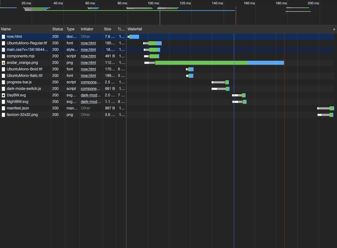

Looking good. I can keep track of my book reading with concise and simple updates. Now I just need to optimize that avatar 😊